There is a particular kind of poster that needs no illustration, no photograph, no imagery at all. It communicates entirely through letterforms — their size, weight, spacing, and arrangement on the page. When done well, a typographic poster can be as visually arresting as any photograph and as emotionally resonant as any painting. It is design stripped to its essential elements: type, space, and the relationship between them.
The golden age of typographic poster design emerged from the Swiss International Style of the 1950s and 1960s, though its roots stretch back further into the Bauhaus and the constructivist experiments of the early twentieth century. What made this period remarkable was not just the quality of the individual works, but the emergence of a coherent design philosophy that treated typography as the primary — and often sole — visual element.
The Swiss Foundation
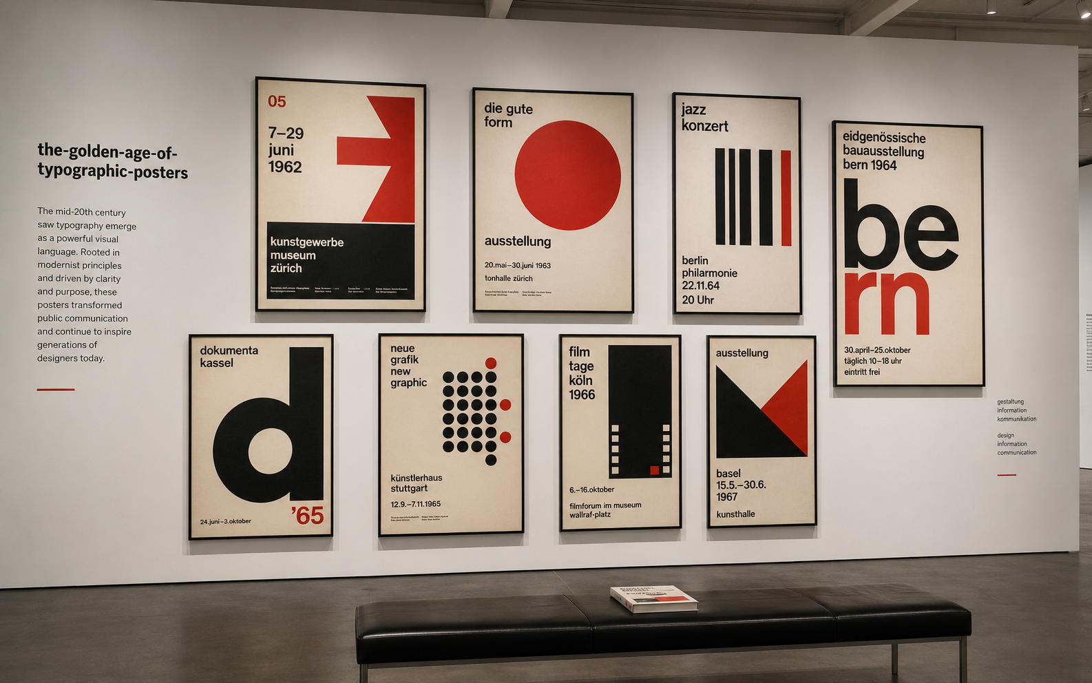
The Swiss approach to typographic posters was rooted in a belief that design should serve communication above all else. Designers like Josef Muller-Brockmann, Armin Hofmann, and Emil Ruder developed systems based on mathematical grids, asymmetric layouts, and a limited palette of sans-serif typefaces — most famously Helvetica, designed by Max Miedinger in 1957. The AIGA's Eye on Design has long recognized this period as foundational to modern design education.
Their posters for concerts, exhibitions, and cultural events achieved a visual clarity that remains startling even today. A Muller-Brockmann poster for the Zurich Tonhalle orchestra uses nothing but black text on a white background, yet the typographic composition creates rhythm, movement, and visual hierarchy that rival any illustration.
Type as Image
The key insight of the typographic poster tradition is that letterforms are inherently visual. They have shape, texture, weight, and personality. When composed with care, they can create visual experiences as rich and complex as any figurative imagery. The letter "A" is not just a symbol representing a sound — it is a triangle balanced on two legs, with negative space trapped inside. Type designers and poster artists have always understood this dual nature of letterforms.
This understanding gave rise to posters where the boundary between text and image dissolved entirely. Words became shapes. Sentences became compositions. The act of reading became inseparable from the act of looking.
Beyond Switzerland
While the Swiss codified the typographic poster as a design form, the tradition has flourished far beyond its Alpine origins. Polish poster designers brought an expressionist intensity to typographic work. Japanese designers fused Western modernism with calligraphic traditions to create typographic posters of extraordinary beauty. And contemporary designers worldwide continue to push the boundaries of what letterforms can do on a flat surface.
The digital revolution, rather than diminishing the typographic poster, has expanded its possibilities. Designers now have access to thousands of typefaces and can manipulate letterforms in ways that would have been physically impossible in the era of metal type and phototypesetting. Yet the fundamental challenge remains the same: how to make letters do the work of pictures.
Still Relevant, Still Vital
The typographic poster endures because it addresses a permanent design challenge — communicating a message with maximum clarity and visual impact using the most basic tools available. In a world drowning in images, there is something refreshing about a poster that trusts type alone to do the job. It is a reminder that constraint often produces the most creative solutions, and that the alphabet remains one of the most powerful visual systems ever invented.